A telco app has to serve all its users
A mobile app owned by a telco company is where its customers check what they have left, top up, and pay the monthly invoice — errands rather than entertainment. Nobody opens it to browse. They open it with something specific to do, and the app is judged on how quickly it lets them finish and leave.
That set the brief. Rebuild it to be fast and legible, hold the highest accessibility rating the app can hold against the EU standards that came into force in June 2025, and bring the existing user base across without asking anyone to relearn an app they already knew.
What the rebuild rests on
One codebase, two platforms
Written once, shipped to both stores
Flutter renders its own widgets rather than delegating to each platform's controls, so a screen looks and behaves the same on iOS and Android without two teams keeping two implementations in step. One fix lands once. One design review covers both stores.
Detail at the pixel, motion with a purpose
Designed in Figma, rebuilt component by component
The interface was rebuilt down to spacing and state changes that are easy to skip and immediately obvious when they are wrong. Animation carries meaning rather than decoration: it shows where a value came from, what is loading, and what changed after a tap.
Built to be used, not to pass an audit
Accessibility inside the components, not bolted on
Accessibility shaped the components rather than arriving as a checklist at the end. Semantics, labels, focus order, contrast and touch targets are part of each widget's definition, which is why the result holds up when the app changes.
Accessibility, tested rather than asserted
EU law requires WCAG Level A and AA conformance for mobile applications, and the European Accessibility Act made that binding across member states in June 2025. Conformance is a floor, though, not a finish line — an app can satisfy a checklist and still be unusable with a screen reader. So the work was verified the way the people who depend on it will experience it.
Screen readers, on real devices
TalkBack and VoiceOver, every flow
Not just labelled, but navigable: reading order that matches the visual order, controls announced with their role and state, and nothing that can only be reached by sight.
Text that scales without breaking
Largest system sizes, nothing clipped
Layouts hold at the largest system font sizes rather than truncating. Anyone who has turned text size up because they need to should still be able to pay a bill.
Contrast, targets and motion
AA thresholds, and reduced motion honoured
Contrast ratios checked against AA, touch targets sized so they can be hit without precision, and animation stood down for anyone who finds it uncomfortable.
Operable without a touchscreen
Keyboard and switch control
Navigation covered without a finger on the glass, so the app works with the assistive hardware people already own.
Payday, when everyone pays at once
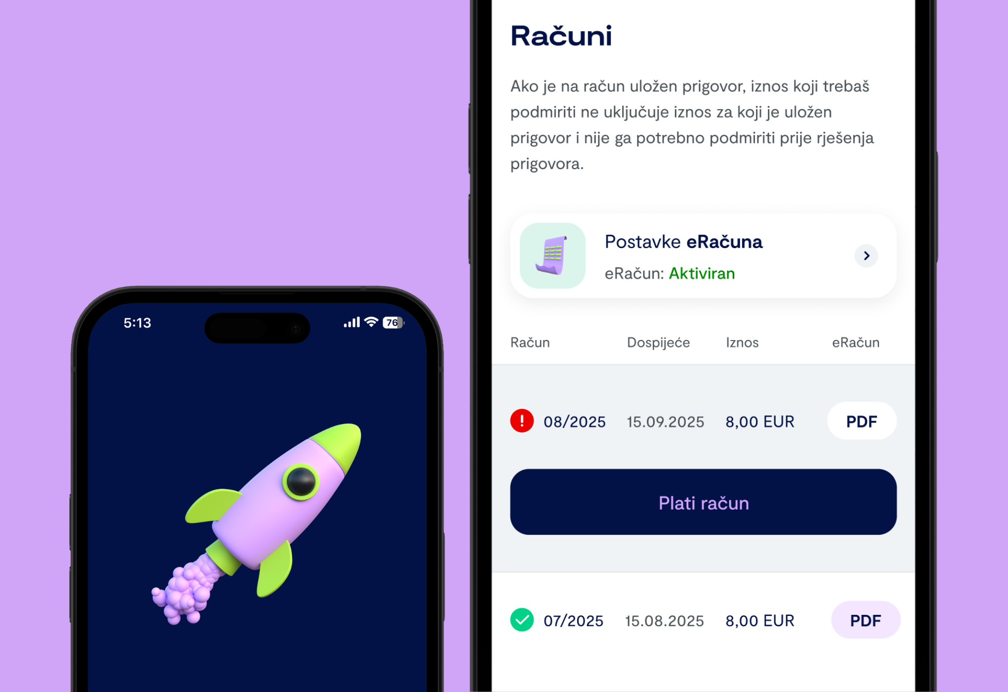
Invoice payments do not arrive evenly. They cluster on the days people are paid and the days a bill falls due, so the payment path carries most of the month's traffic in a handful of hours. Braintree handles the card data, which keeps sensitive details out of the app entirely, and the flow around it is built to survive the spike: a payment that is interrupted can be resumed rather than restarted, and a customer never has to guess whether money left their account.
Moving a user base across without a jolt
A rebuild is the easiest moment to lose people. Half a million existing users already knew where everything was, and the fastest way to make an app feel worse is to move it. The new app keeps the paths people had already learned, so the upgrade reads as the same app made quicker rather than as a replacement to be worked out from scratch.
Firebase and Google Analytics carry the evidence for that — which screens people reach, where they stop, and what breaks on which device — so changes after launch answer to behaviour rather than opinion.
At this scale, nobody is an edge case
The app has passed half a million downloads. At that size, any group small enough to be waved off as an edge case is still thousands of people — and a telco app is not optional software. Checking a balance or paying an invoice is something people have to do, on whatever device they own and with whatever assistance they use.
Which is why the accessibility work does not only serve the people it is named for. Legible contrast, text that scales, a sensible focus order and controls that announce what they do all help someone reading in bright sunlight, working around a cracked screen, holding a child in one arm, or simply tired at the end of a long day. Building for the hardest case makes the ordinary one better.
The European Accessibility Act turned that into a legal obligation in June 2025. It was the right way to build the app before it was the required one.
Team
- —Antonio Krušlin
- —Martina Đođo
- —Dominik Mesek
Key objectives
Rebuild the app so it is quick to open and quick to use — the two things a self-service telco app is judged on.
Reach the highest accessibility rating the app can hold, against the EU standards that became law in June 2025.
Move the existing user base across from the old app without anyone having to relearn where things are.
Take the monthly invoice payment reliably on the days when most of the country pays at once.
Services
- —Mobile development
- —Digital accessibility
- —Testing
Technology
Numbers
500K+
Downloads
AA
WCAG conformance level, as EU law requires
1
Codebase serving both iOS and Android
2025
European Accessibility Act in force across the EU